


A brand for a new coffee & wine bar.
A logo system, visual identity and brand guidelines for WiWine in Sofia - specialty coffee by day, wine by night. Stage 1 of a two-stage branding project.
Thanks — the PDF should open in a new tab.
Voidweb understood our concept right away: coffee by day, wine by night. They turned it into one brand we are proud to put on every cup.
A new venue with two moods and one name.
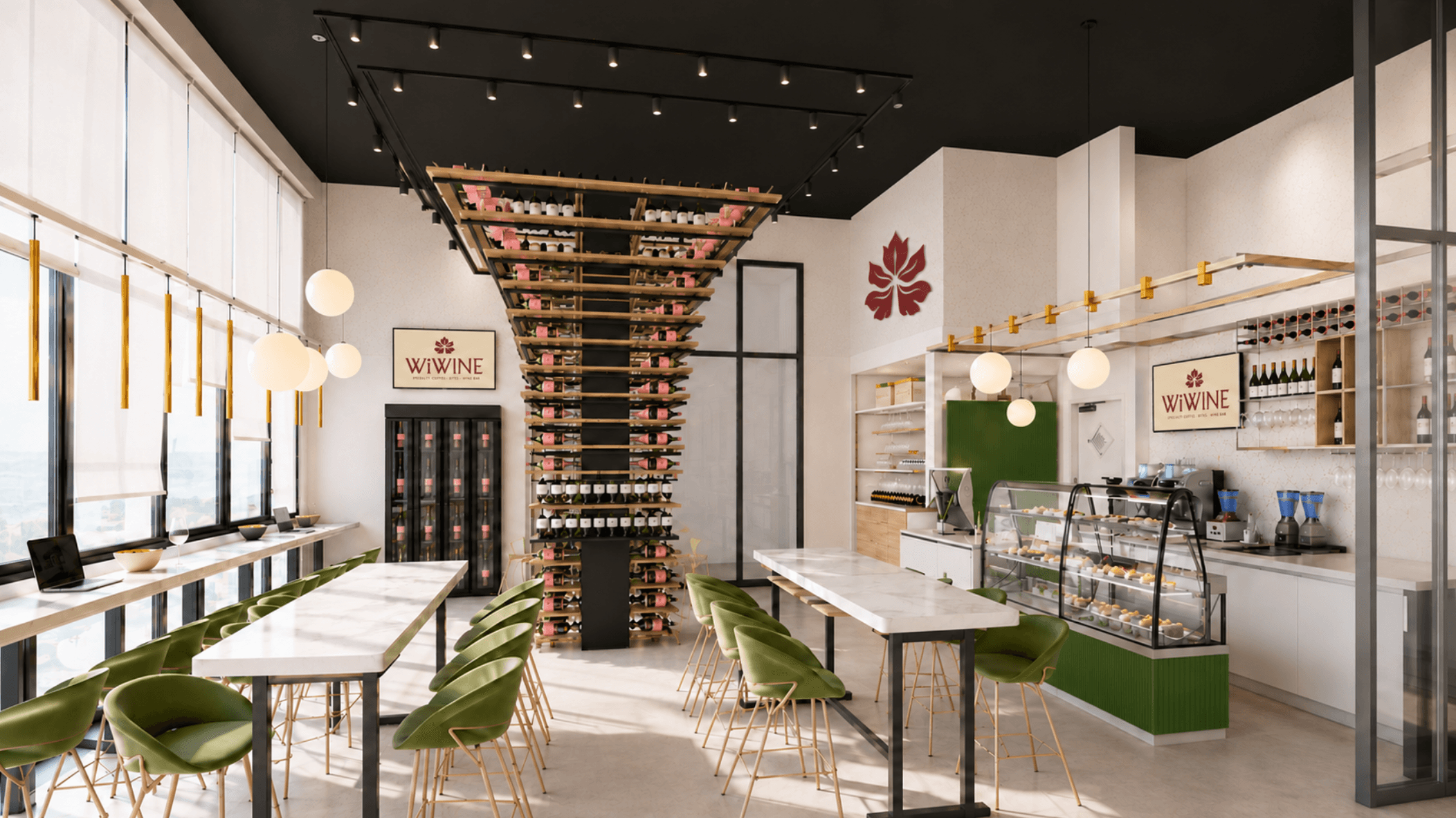
WiWine is a new venue in Sofia, started by a team with its own wine brand. Alongside their wine, they offer specialty coffee, a calm place to work during the day and bites for breakfast and lunch. The interior is built around a wine tower suspended from the ceiling.
The team came with a detailed brief, a working name and visual references. They needed one identity that is elegant, modern and urban, feels right with a morning coffee and an evening glass of wine, and is ready for the facade, cups, aprons and packaging before opening.
- 01One brand, two moods coffee by day and wine by night, without splitting into two identities.
- 02Food without a restaurant feel present in the brand, but never the main story.
- 03Refresh, not replace keep the spirit of the existing “Wi” concept while giving it a stronger mark.
- 04Ten deliverables in the brief, from logo to social media templates, that needed a clear plan.
- 05A mark that stays readable from a coffee cup to a facade sign.
- 06A tight timeline ahead of opening.
A brief mapped point by point, delivered in two stages.
Voidweb linked every deliverable in the proposal to a numbered point in WiWine’s brief. Stage 1 covers points 1–7: the logo system, colour, typography, pattern, brand book and mockups. Stage 2 covers points 8–10: signage and interior, print and digital.
Team. Voidweb’s growth team shaped positioning and tagline alongside the design, with live working sessions on the design.
Two concepts, two rounds. Up to two initial concepts, then up to two consolidated rounds of revisions on the chosen direction, with feedback in 3 working days.
Positioning, audience and references turned into concepts
Versions, emblems and a monogram for every surface
Palette with a morning and evening mode, typography
Rules for logo, colour, type, applications and tone
Facade, cups, apron, tote; files for print and digital
Two leaves, one root, built for day and night.
The symbol. Coffee and vine leaves grow into one symbol: the day and the evening of one place. After the first presentation the client asked for a broader, more recognisable vine leaf, and the symbol was reworked around that.
Logo system. A flexible system with versions for signs and menus, packaging and posters, and small spaces, plus emblems and a monogram for stamps, cups and social media.
Morning and evening. A warm, elegant palette inspired by wine, coffee and the interior. By day the brand is lighter and calmer; by night it becomes darker and warmer.
Typography. A type system for headlines, menus and the brand’s signature, in Latin and Cyrillic, easy for the team to use every day.
Tagline and tone. “Specialty Coffee · Bites · Wine Bar” puts food in the middle without a restaurant feel. The voice is a good host: warm, simple and refined.
Delivery. A complete brand book with a guide to which version goes where, from the facade to the coffee cup, plus organised, production-ready files.
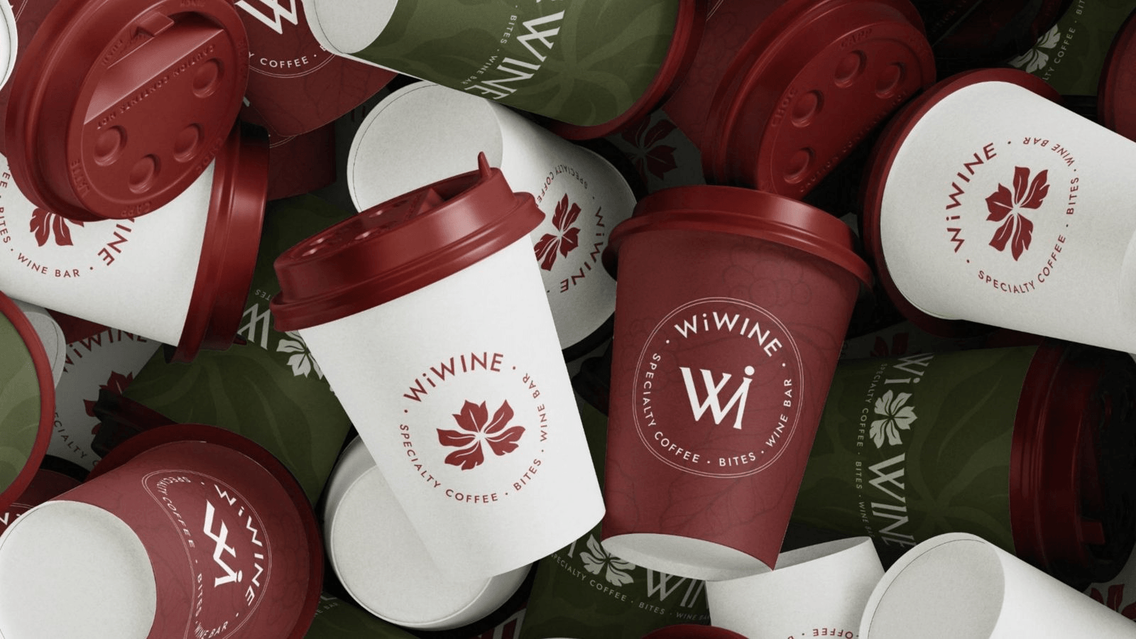
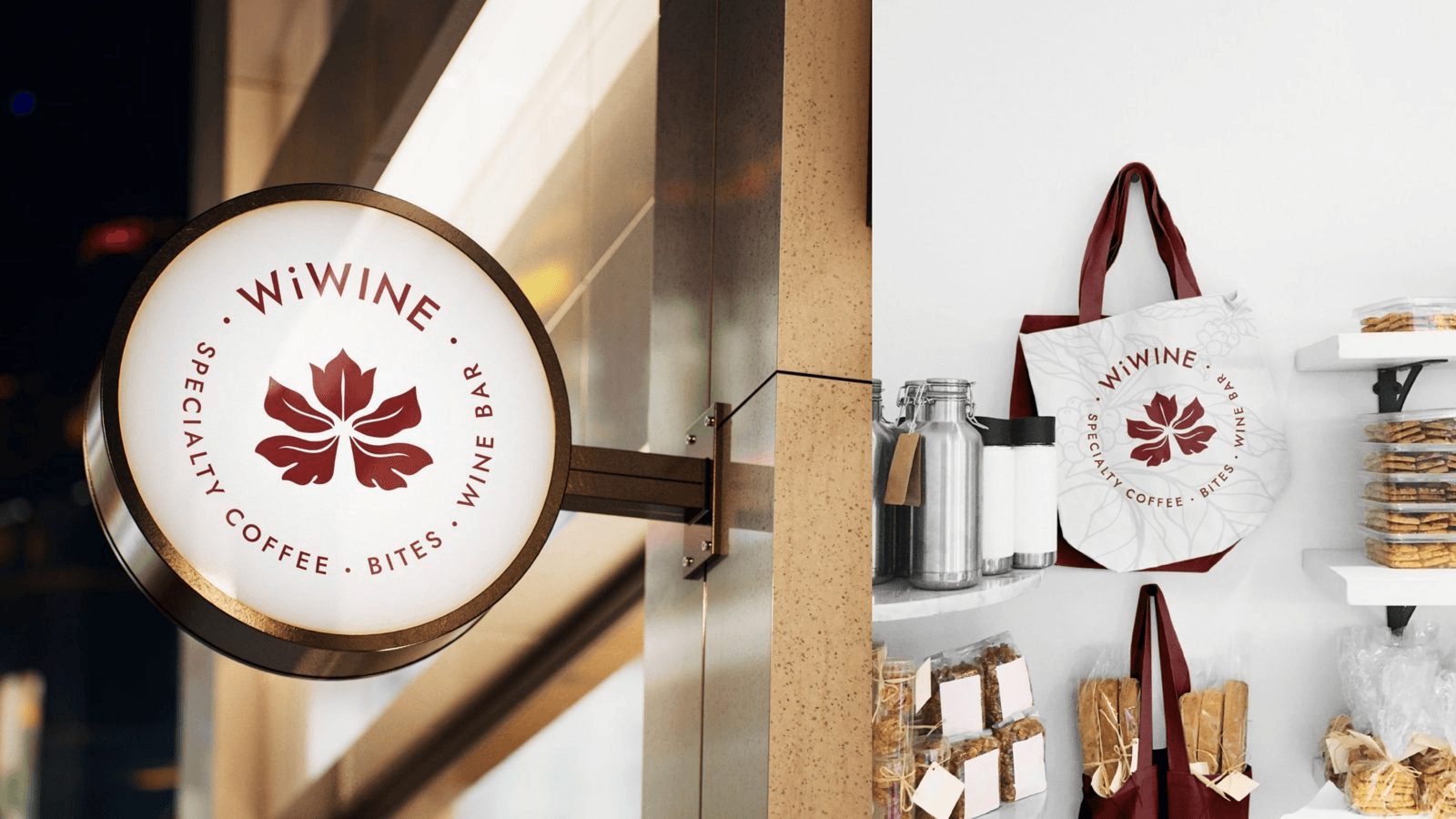
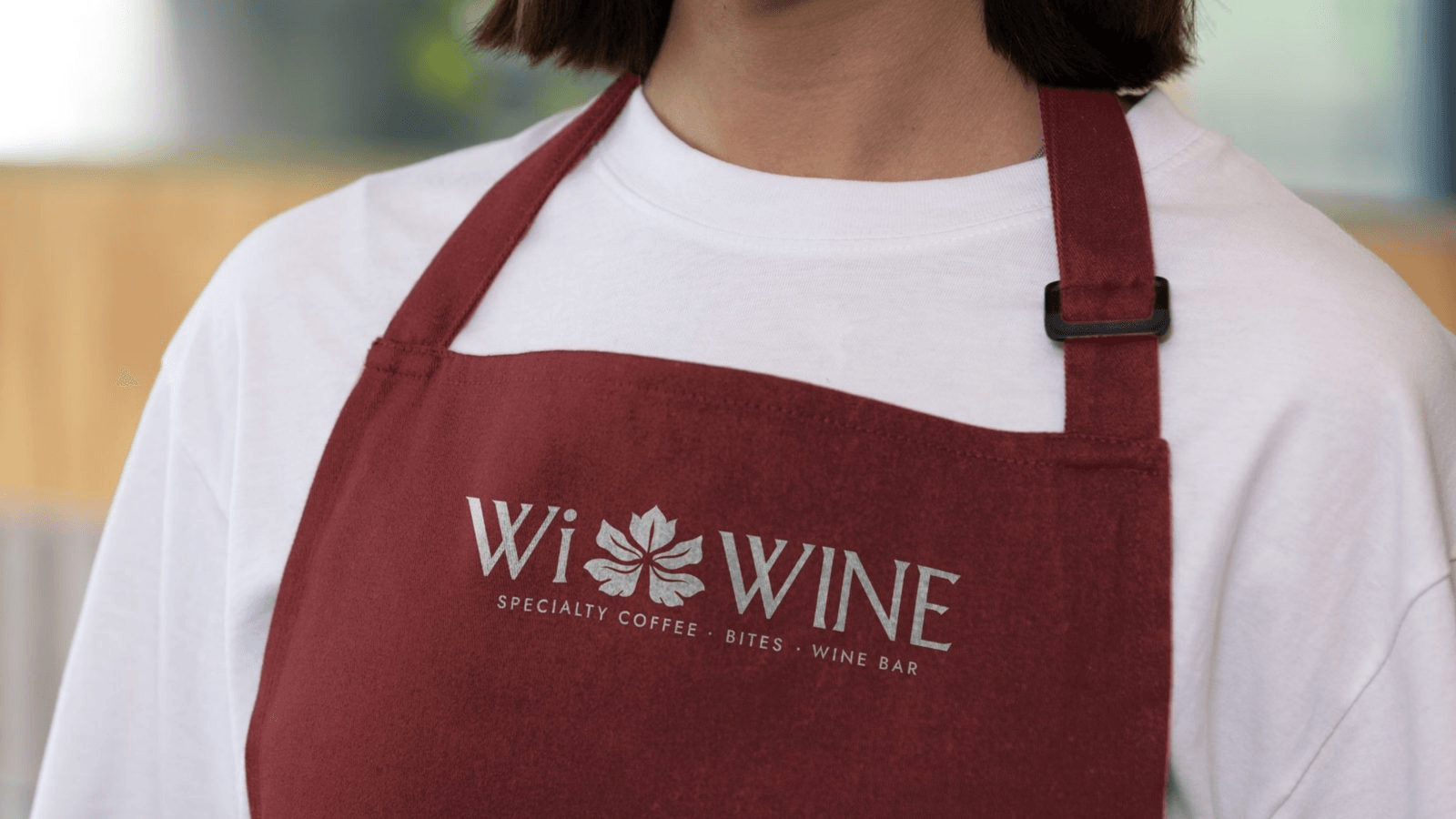
One brand from the first coffee to the last glass of wine.
- 01One identity with a morning and an evening mode
- 02A flexible logo system for every surface, from sign to sticker
- 03Palette and typography for print, screen and Cyrillic
- 04A complete brand book rules, applications and tone of voice
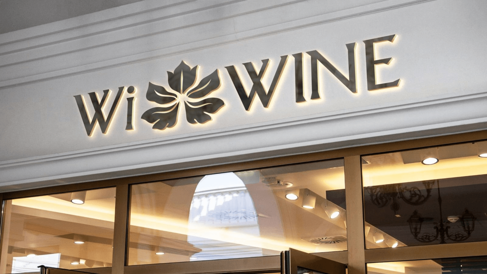
- 05Ready for the venue facade sign, cups, aprons and tote bags
- 06A clear next step Stage 2: signage, print and digital
Brand thinking, delivered fast and in phases.
Brief to proposal, point by point: every item in WiWine’s brief was mapped to a deliverable, so scope and timeline were clear from day one. Brand thinking, not just a logo: positioning and tagline were shaped alongside the design. A phased approach: the core identity first, then signage, print and digital. And a local Bulgarian team in the same language and time zone.
Read next

A website and client portal for a new electricity trader.
Building a Field-Sales CRM for an Oil Distributor in Two Weeks
Let's ship.
Tell us what you're building and where it's stuck. You'll hear back from a partner, not a form.